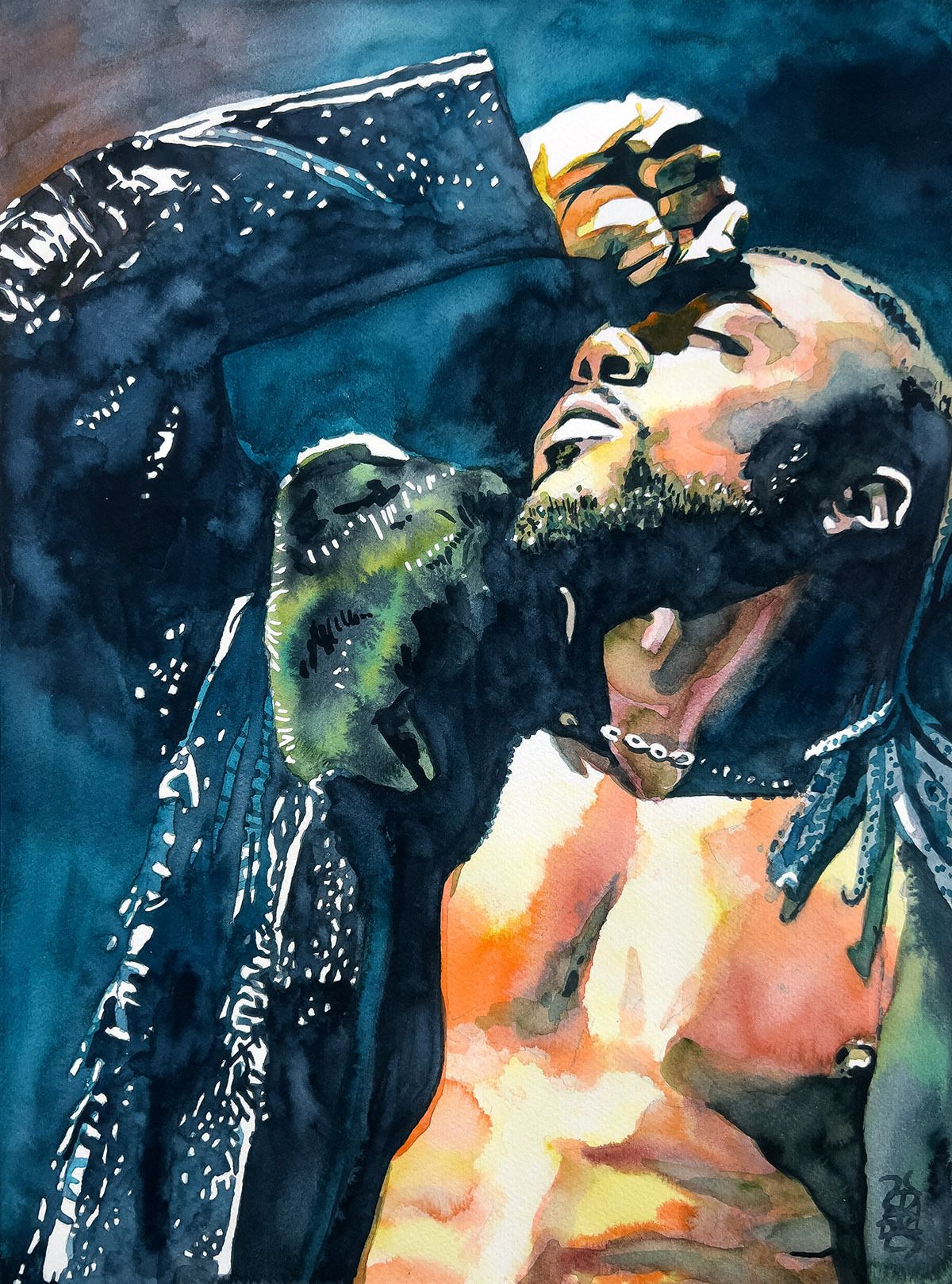
Click here to get yours. Only 50 available! SIGNED! These go on sale in half an hour at 12PM CST.
Hi. My name's Rob Schamberger. I'm that guy who paints rasslers. And other stuff. Something is coming for you. Look out!
WORDS
This Beast Mortos painting was almost as fun to make as it is to say ‘Beast Mortos’. The simple color palette helps to put the focus on the mask and especially his eye looking through it. It’s haunting yet campy. I got the inspiration by looking through Mexican horror movie posters and tried to match the vibe of them, if that makes sense.
UPCOMING AEW/PWT PRINTS
Jon Moxley. Maybe!
Julia Hart
Thekla
Jamie Hayter
Harley Cameron
Card subject to change.
Rob’s Art on ShopAEW
###
Rob and Jason Arnett's novella Rudow Can't Fail!
###
Rob’s prints and shirts at Pro Wrestling Tees
###
Bluesky
Cara
YouTube
###
Katy’s book Oldest Kansas City

ART I LIKE
Robert Fawcett was one of the preeminent figures of what’s called the Golden Age of American Illustration. You hear the term “an artist’s artist” a lot but when the New York Society of Illustrators had him talk, the room was full of other artists and they had to keep the doors open because more were crowding the hallway just to listen in. He had a distinctive style for sure, but it was the way he made everything feel so lived in and tactile and rendered with the weight of a Renaissance painting that made him stand apart from his peers.

He also was known in illustration circles for standing his ground against stupid client notes. For instance, he pulled the above Napoleon piece back from the client because he thought their note about redrawing the face would go against his personal standards. But he was so damn good that everyone still wanted to work with him instead of a ‘difficult to work with’ reputation blacklisting him. I respect the hell out of that.

Another fascinating fact about Fawcett is that he was color blind. He found a way around this by working with black ink or paint and grey midtones first. He would then apply flat glazes of color over the top of those by literally reading the name of the color on the paint tube and assuming that would look good! I hazard a guess that’s why his compositions are so strong, because the positive/negative spaces are so integral to his process.
Nature finds a way and so do artists.

In that time before every home had a television set and definitely before they were all color TV’s and for sure before things like VCR’s, illustrators were among the most important ways that visual ideas could be communicated to people right in their homes. Names like Rockwell, Leyendecker and Robert Fawcett were as big as the names of the big directors of today. Like, LOOK at the story being told in that bar scene above. There’s a whole feeling that’s being communicated in a very captivating way.
Fawcett’s work equally inspires me and makes me want to throw a brick through my drawing table, it’s so good.

Yum Yum
FOOD, DUDE!
It was really cold this past weekend so Sunday night I decided to make a batch of Martha Stewart’s Perfect Mac and Cheese recipe. I modified it by chopping up a bell pepper, an onion and a bunch of mushrooms, sautéing that all up and then adding it to the cheese sauce. I also added some garlic salt to the butter for the breadcrumb topping to turn it into, you guessed it, a garlic breadcrumb topping.
This makes a lot so that also sorted our lunches for the week. Win-win!
Love you more,
Rob
